The Day the Diving Eagle Landed
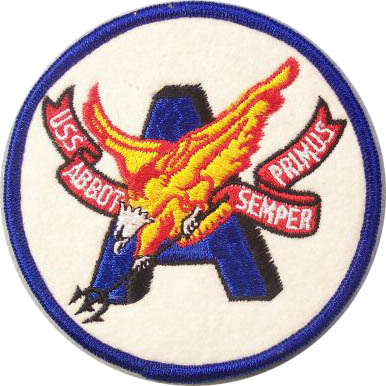
How Abbot’s logo was born
By Doug Hearle


According to the Bluenose Certificate hanging over my desk, the Abbot crossed the Arctic Circle on September 20, 1957, on her way to the top of the world. She was one of four destroyers that were escorting the aircraft carrier Intrepid on anti-submarine picket duty. I was a member of Abbot’s ship’s company.
After participating in a NATO exercise with British and French forces in and around the English Channel, we put into Chatham, England, for some yard work and liberty and then went on to Belfast, Northern Ireland, to provision for our Arctic deployment.
While “the fleet was in” in Belfast, there were a lot of “white hats” on liberty and the local authorities requested a heavy presence of the USN Shore Patrol. The assignment was given to all ships to provide petty officers for this duty. I was a YN3 at the time and caught the duty over the weekend. No liberty for me — Shore Patrol.
Somehow, when the patrolling was done, two six-packs of Budweiser had found their way to a filing cabinet in the ship’s office of the Abbot.
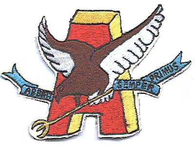
On our first night at sea after clearing Belfast, I was in the ship’s office with another yeoman, Don Sendgraft, finishing up some routine paper work, when we decided to break out our little private Irish souvenirs. As we quietly sipped, my eyes fell on the label on the bottle. It contained the image of an eagle with its wings spread against the background of a large capital A — for Anheuser (as in Anheuser-Busch). I remarked to Sandy that it would make a great symbol for our ship: An eagle… The A for Abbot… and maybe a bit more angry-looking than the beer bird.
I liked to draw at the time. Did a lot of goofy cartoons. I started doodling my thoughts. Sandy said we should add a weapon to suggest a warship so we settled on a trident, the weapon of choice of Poseidon, the god of the sea. Instead of just spread wings, I put our eagle into a dive to make him more aggressive.
We added a bit of culture to the scene by adding a Latin phrase: Semper Primus. This was three beers into the project and our creativity was flowing. Semper Primus — Always First — had two meanings to us: Abbot was alphabetically the first ship in the list of destroyers in the Atlantic Fleet. She was also reputed at the time to be the fastest Fletcher-class ship.
We decided to color our eagle gold and red and to put him against a blue A.
I believe we kept it our little private object d’art in the office for the next few weeks. When our Arctic cruise was over, we went to the yards in South Boston for overhaul. It was there that I gave the design to our executive officer, F.J. Korb.
On the very day that Abbot put to sea for her shakedown cruise following several months in Boston, I was transferred to the COMDESLANT staff aboard the destroyer tender Yosemite in Newport, Rhode Island. That was in March 1958.
I never gave another thought to the Diving Eagle logo until four decades later when I got a letter in the mail inviting me to a reunion of the Abboteers and there was “our bird” on the letterhead. How it made its way to some sort of official acceptance is still a mystery to me.
But I still smile every time I see it.